


The Gateway Arch and Riverboats Trade Profile
-
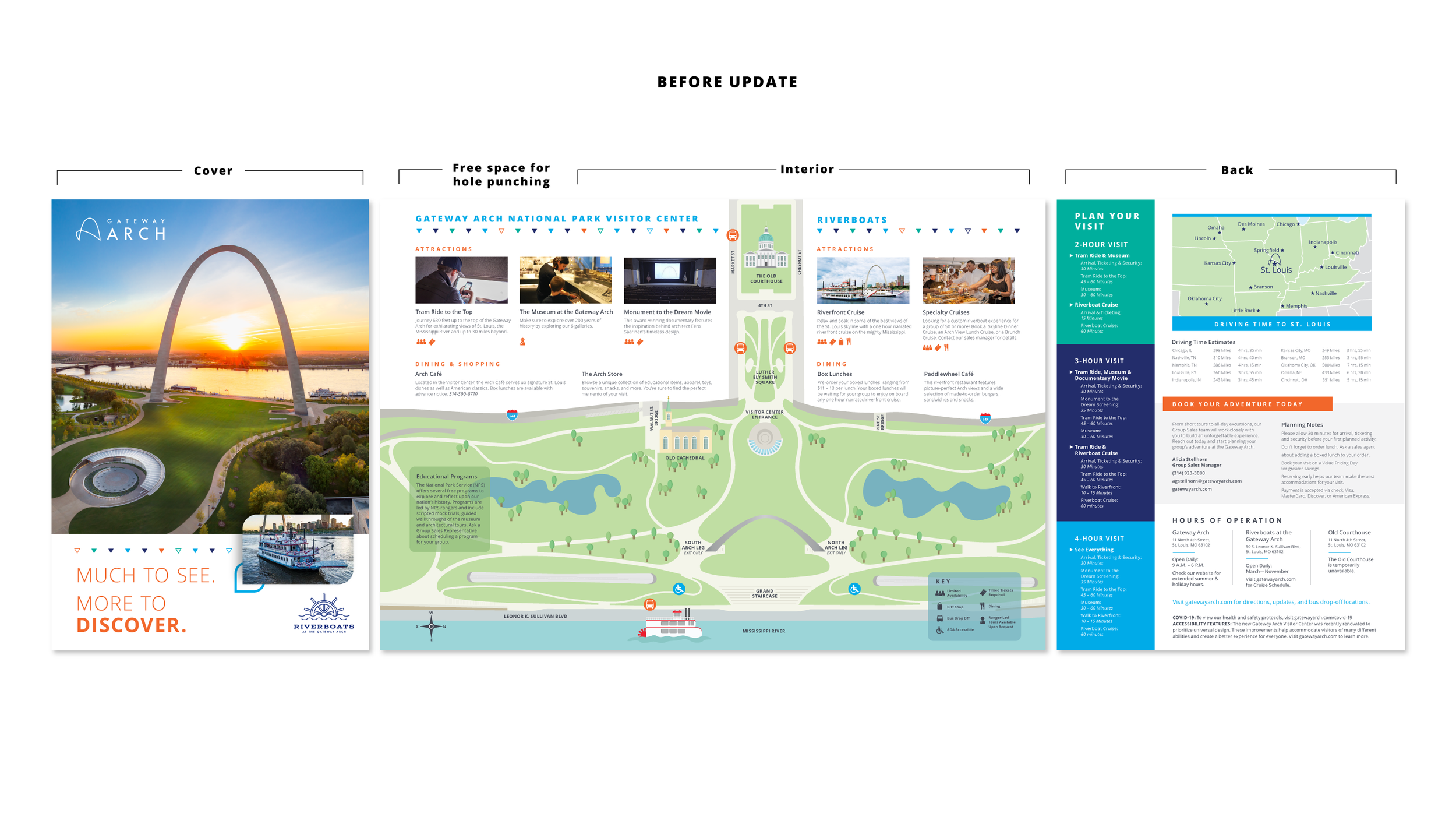
The previous trade profile lacked the eye-catching part of tourism materials that make visitors want to explore. It was, primarily, an informative document rather than a promotional item.
I updated it to include greater visual strength, brighter colors, and a better focus on the profile’s essential assets.
The key for the attractions and restaurants was retained, but I included a second layer of association through color coding. Orange for the Arch, teal for the Courthouse, and blue for the Riverboats.
Information about the attractions is laid out in a more thorough and organized manner. Better descriptions paired with better, bigger photos of each attraction rather than just a few.
The map was consolidated into the most important cross section of Gateway Arch National Park, ensuring it can still be used for the attractions listed within the profile.
-
The trade profile had a unique set of dimensional parameters that had to be followed. It could only be a “single" page, though it could be folded several times, and it needed to have space for hole-punching to fit in a binder.
I opted to create a lip where the hole-punches would go, so that information or photos would not end up with holes.
The map that took up the majority of the previous profile’s design was also converted into a third, inner flap with a tear-away edge. The idea was that if visitors did not want to carry the entire profile with them, they could take only the essentials: the park map and their plans.